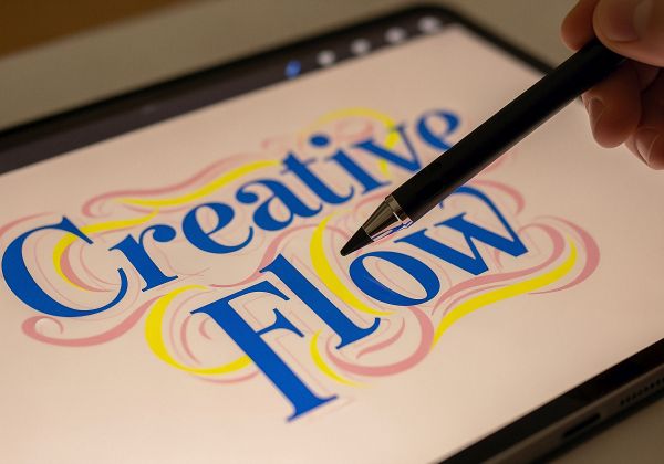
Logo & Graphic Design Strategies
Logo and Graphic Design Strategies That Win Online
What the Top Brands and Experts Do Differently—and How to Build Visual Branding That Actually Converts
In online marketing, your logo and graphics are not decoration. They are communication tools, trust signals, and conversion assets. Long before someone reads your copy, watches your video, or joins your email list, your visuals are already telling a story about who you are, what you stand for, and whether you are worth paying attention to.
The biggest mistake most businesses make is treating logos and graphics as “art.”
The most successful brands treat them as strategy.
This article breaks down the real logo and graphic strategies used by top online brands, what most people get wrong, how experts think about branding visually, and how you can apply the same principles—regardless of budget or design skill.
Why Logos and Graphics Matter More Online Than Anywhere Else
Online, people make decisions faster than ever.
You don’t get:
First impressions
Second impressions
Or “benefit of the doubt”
You get milliseconds.
Your logo and graphics must instantly answer subconscious questions like:
Is this professional?
Is this credible?
Is this relevant to me?
Is this modern or outdated?
Is this safe to trust?
In physical businesses, reputation can grow through location and familiarity.
Online, visual branding is reputation.
The Biggest Branding Myth That Holds People Back
Myth: “I need a fancy or complex logo to look professional.”
Reality: The most powerful logos in the world are simple, intentional, and versatile.
Think about brands that dominate online:
They are recognizable at tiny sizes
They work in black and white
They scale across platforms
They look good everywhere
Complex logos fail online because digital environments demand clarity, flexibility, and speed of recognition.
How Experts Think About Logos (That Most People Don’t)
Logos Are Not Art — They Are Anchors
Experts don’t design logos to impress other designers.
They design logos to anchor memory.
A great logo:
Is easy to recall
Is easy to recognize
Is easy to reproduce
Creates emotional familiarity
That’s why top brands prioritize:
Shape over detail
Consistency over creativity
Meaning over decoration
Logos Are Built for Systems, Not Just Screens
Experts design logos to live inside systems:
Websites
Funnels
Social profiles
Video overlays
Thumbnails
Ads
Email headers
Favicons
If a logo only looks good on a website header, it’s not a strong logo.
The best logos work:
Large and small
Horizontal and vertical
Color and monochrome
Digital and print

The Core Principles of Powerful Logo Design
1. Simplicity Always Wins
Simplicity isn’t boring — it’s strategic.
Simple logos:
Load faster visually
Are easier to remember
Scale better on mobile
Don’t break on social platforms
Experts strip logos down to the essential idea and remove everything else.
If your logo needs explanation, it’s doing too much.
2. Shape Matters More Than Color
Color can change.
Shape should not.
Experts focus on:
Unique silhouettes
Balanced geometry
Distinctive outlines
Because even without color, a strong logo should still be identifiable.
This is why great logos work in:
Black
White
Grayscale
Color is enhancement — not identity.
3. Versatility Is Non-Negotiable
Experts never design “one logo.”
They design logo systems, including:
Full logo
Icon or mark
Horizontal version
Vertical version
Simplified micro version
This ensures the brand looks polished everywhere — from a website header to a social profile photo.
4. Meaning Is Subtle, Not Obvious
The best logos often have meaning — but it’s not screaming at you.
Experts use:
Symbolism
Negative space
Directional cues
Psychological associations
But they keep it subtle enough that the logo still works even if the meaning isn’t consciously noticed.
Meaning should enhance recognition — not complicate it.
Graphic Design Strategy: Where Most People Go Wrong
Many businesses design graphics piece by piece, without a system.
Experts design visual ecosystems.
This includes:
Color palettes
Typography hierarchy
Icon styles
Image treatments
Layout patterns
Without a system, graphics look inconsistent and amateur.
With a system, even simple designs look premium.
Color Strategy: What Experts Actually Do
Fewer Colors = Stronger Brand
Most expert brands use:
1 primary color
1–2 supporting colors
Neutral tones (black, white, gray)
They don’t use every color they like — they use colors that:
Support emotion
Create contrast
Improve readability
Too many colors dilute recognition.
Color Psychology Is Directional, Not Absolute
Experts understand that:
Blue = trust, stability, clarity
Green = growth, balance, calm
Red = urgency, energy, power
Black = authority, luxury, confidence
But they also know context matters more than theory.
Color choice must align with:
Audience expectations
Industry norms
Brand personality
Typography: The Silent Authority Signal
Typography is one of the most underestimated branding elements.
Experts use typography to signal:
Confidence
Modernity
Simplicity
Authority
Best Practices Experts Follow
Limit fonts (usually 1–2 families)
Prioritize readability over novelty
Use font weight and spacing strategically
Maintain consistent hierarchy
If people struggle to read your text, they won’t trust your message.
Graphic Consistency Builds Trust Faster Than Perfection
One of the biggest secrets in branding:
Consistency beats creativity.
Experts would rather:
Use a simple design repeatedly
Than constantly reinvent visuals
Consistency creates:
Familiarity
Trust
Recognition
Authority
This is why even simple graphics become powerful when used consistently over time.
How Experts Design Graphics for Social Media
Social media graphics must work fast.
Experts optimize for:
Mobile screens
Fast scrolling
Small attention windows
What Actually Works
High contrast
Clear focal point
Minimal text
Strong visual hierarchy
Consistent layout templates
They design so viewers understand the message within one second.
Templates Are a Power Move
Experts rarely design from scratch every time.
They use:
Reusable templates
Consistent spacing
Repeatable layouts
This speeds production and strengthens brand recognition.
Templates are not lazy — they’re strategic.
Graphic Design for Funnels and Conversions
In funnels, graphics are not decoration — they are directional tools.
Experts use graphics to:
Guide the eye
Reinforce messaging
Reduce friction
Increase clarity
Examples include:
Arrows pointing to CTAs
Icons reinforcing benefits
Visual separation of sections
Consistent button styles
Good funnel graphics quietly guide behavior.
What the Best Brands Do Differently
They Design for Emotion First
People don’t connect to pixels — they connect to feeling.
Experts design graphics that evoke:
Calm
Confidence
Excitement
Safety
Inspiration
They choose visuals that match how they want people to feel, not just what looks good.
They Protect Brand Integrity
Top brands are ruthless about consistency.
They don’t allow:
Random colors
Unapproved fonts
Off-brand graphics
Everything passes through a brand filter.
This discipline is what separates strong brands from scattered ones.
They Think Long-Term, Not Trend-Based
Trends change.
Brands endure.
Experts avoid designs that are:
Overly trendy
Gimmicky
Platform-dependent
They focus on timeless clarity.
How to Organize a Winning Logo & Graphic Strategy
Step 1: Define Brand Personality
Before designing anything, clarify:
Who you serve
What you stand for
How you want to be perceived
Is your brand:
Bold or calm?
Modern or classic?
Technical or approachable?
Design follows identity — not the other way around.
Step 2: Build a Visual Foundation
Create:
Logo system
Color palette
Font set
Icon style
This becomes your visual rulebook.
Step 3: Create Repeatable Assets
Design:
Social media templates
Funnel graphics
Ad layouts
Thumbnail styles
This saves time and builds consistency.
Step 4: Audit Everything Regularly
Experts review:
Websites
Social profiles
Funnels
Emails
They remove anything off-brand.
Brand clarity compounds over time.
The Hidden Advantage of Great Visual Branding
Strong logos and graphics do more than look good.
They:
Reduce resistance
Increase perceived value
Build trust before words are read
Shorten the decision-making process
People don’t just buy products — they buy confidence.
Your visuals either provide it or take it away.
Final Thoughts
The best logos and graphics in online marketing are not flashy.
They are intentional, consistent, and strategic.
Experts don’t chase design trends.
They build visual systems.
They don’t decorate — they communicate.
They don’t impress — they convert.
When your branding is clear, cohesive, and aligned with your message, everything else works better:
Content performs better
Funnels convert better
Ads feel more trustworthy
Your authority grows faster
In a noisy digital world, clarity is power.
And great logos and graphics are where that clarity begins.
